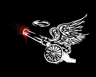
i'll be posting more from this series of graphics in the near future... but first here's the process.
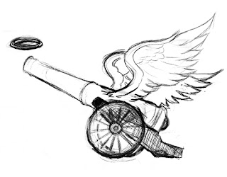
1. initial sketch- pencil on paper.
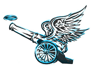
2. inking- scanned sketch as grayscale. changed to blue in photoshop and printed out. inked directly on top of the printout and rescanned as rgb.
3. dropped blue channel & adjusted contrast using curves leaving only my cleaned up ink lines. manipulated lines to look like spraypaint- involving dissolve layers, smudge tool, filters- including spatter, gaussian blur, unsharp mask, clouds, ect., quick masks, brush tool... pretty normal photoshop tricks.
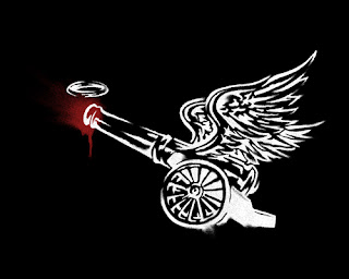
4. the inevitable revise. repositioned and resized the halo (and the branding... which i've removed for this post-- but i gotta give another shout out to house industries for their
flyer fonts collection)