
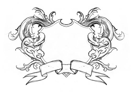
initial pencil sketch. just to get the idea out there and a feeling of the proportions that the design will have.
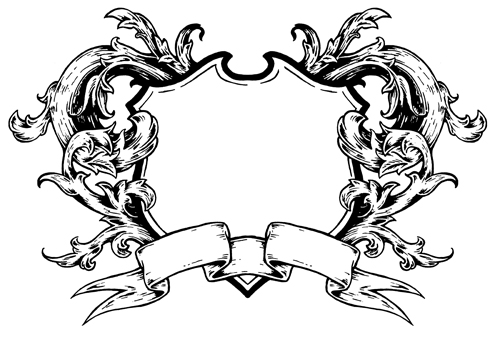
inked. this is the art that i used/modified for the design.
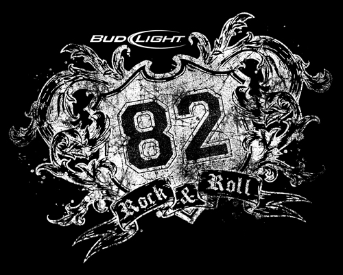
computer work. dropped in some logos, grit, and distressing.

revision #1. Anheuser Busch decided that they wanted to use this for Bud Light instead of Budweiser. Also, they wanted to change the location that the graphic was placed on the shirt which required the slight tilting of the graphic. I decided to make it rougher and more distressed for them as well.
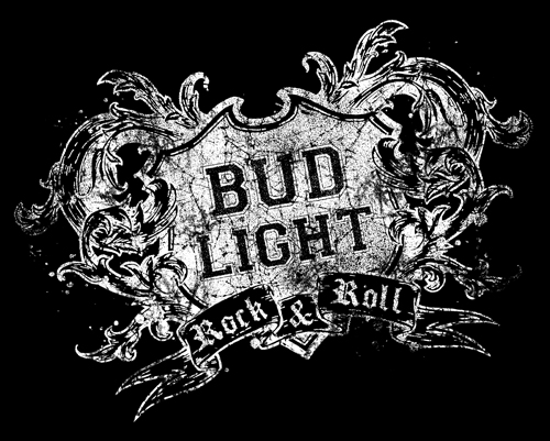
revision #2. they wanted more of an emphasis placed on "bud light" and not so much on the "82". this was my final art but i believe that it was printed in a color ink other than white.


No comments:
Post a Comment