merry christmas and happy new year to everyone! i'll be heading to spend the holidays with the family tomorrow!! hopefully i'll be able to post some pics when i get back.
here's another crab-themed festive illustration that i did that (again) wasn't used by the client... but i really like the way this one turned out anyway!
cheers, until next year -josh
Thursday, December 21, 2006
Wednesday, December 20, 2006
dirty
today i looked down at my keyboard and realized how gross i am.
i'm guessing most of the grit is graphite from me going straight from the drawing table to the computer. either that or dirt may actually ooze from my fingertips. i dont know which is worse... the fact that my keyboard looks like this or that i didn't even notice it until just right now.... or maybe that i decided to take a picture of it instead of clean it.
Tuesday, December 19, 2006
my first chucks
can't forget about the little guys.
here's a simple design i did with some hand drawn lettering.
you can buy a onesie w/ this design on it here or at Journeys KIDZ stores.
here's a simple design i did with some hand drawn lettering.
you can buy a onesie w/ this design on it here or at Journeys KIDZ stores.
Tuesday, December 12, 2006
las vegas half marathon
Sunday, December 10th I ran 13.1 miles with my brother. it was an awesome feeling to cross that finish line and one that i won't soon forget.
It was quite the experience to run right down the middle of The Strip... past the Blue Man Group at the start line, the Mandalay Bay, the performing Ozzie cover band, past the Balagio, the "run-through" wedding chapel, the hords of running "Elvi" (I guess that is Elvis pluralized), through Freemont Street, the Blondie cover band, and back to the finish line. All of the many hours of training I had put in were worth it. what a GREAT WEEKEND!!!!!
at the start line trying to stay warm.
one of the many running elvi
victory!
victory with medals and gold stuff that they give you.... my brother kind of looks like he's taking a dump in this picture. i don't think he was though.
the only way to celebrate completing a vegas half marathon: an ice bath and a bottle of champagne.
my superhero impersonation. check out those sweet $10 velcro shoes from walmart! i received a couple of comments about them as i ran. no complaints from me nor from my feet though!
Wednesday, December 06, 2006
Thursday, November 30, 2006
bud crest
here's a sneak peek of a tee graphic i did for Bud Light.
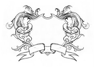
initial pencil sketch. just to get the idea out there and a feeling of the proportions that the design will have.
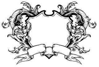
inked. this is the art that i used/modified for the design.
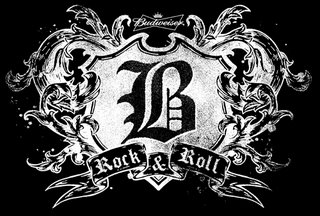
computer work. dropped in some logos, grit, and distressing.
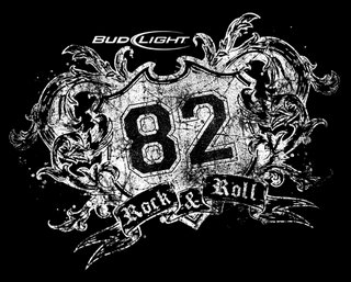
revision #1. Anheuser Busch decided that they wanted to use this for Bud Light instead of Budweiser. Also, they wanted to change the location that the graphic was placed on the shirt which required the slight tilting of the graphic. I decided to make it rougher and more distressed for them as well.
revision #2. they wanted more of an emphasis placed on "bud light" and not so much on the "82". this was my final art but i believe that it was printed in a color ink other than white.
Tuesday, November 21, 2006
Monday, November 13, 2006
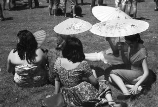
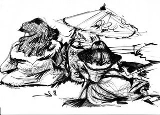
rockabilly gals
i went to the hootenany a while back. it was a great time... filled with great bands... and the people-watching was second to none. i felt like i had stepped back in time. so many amazingly outfitted people. i've been wanting to do something illustration-wise with the pics that i snapped durring the festival and this is finally a start. hopefully i will make future posts with my progress....
pic:
initial sketch:
i would like for this to be a very horizontal peice. wish me luck on getting this going.
pic:
initial sketch:
i would like for this to be a very horizontal peice. wish me luck on getting this going.
Thursday, November 09, 2006
this is my artful photography
Tuesday, October 31, 2006
Rock Star Weekend
just got back from the fest in gainesville, fl. it was a blast!.... hanging out with friends i hadn't see in a while, my cardinals winning the world series, and seeing so many great bands.... it may have been the perfect weekend if it wasn't for the 20+ hours of sitting on planes and in airports that it took to get there and back.
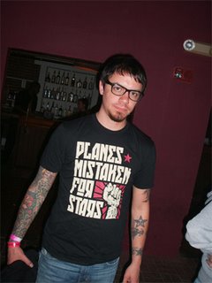
a while back i did a tee design for planes mistaken for stars and over the weekend i was able to pick up a shirt from their merch table when i saw them play. they're such good guys and were really appreciative of me doing the art for them. i think they still owe me a couple of drinks for it though.
and, if that wasn't cool enough already, the next day i saw this dude wearing the design that i did at a different show... and i went all dork on him and asked to take his picture. i would normally not do this, but i was still just so excited about the whole thing and had a couple of beers in me as well. it was pretty cool not only seeing one of my designs for sale from one of my favorite bands but also knowing some random guy liked it enough to buy one for himself.
Wednesday, October 25, 2006
GO CARDS!
Tuesday, October 24, 2006
Monday, October 23, 2006
pencilbomb has a new home!
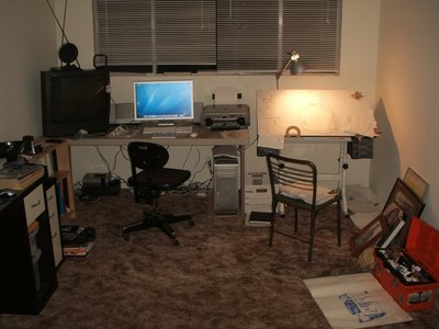
me and my best girl recently moved to this cool little old town and into a bigger apartment for the same rent as our old one (and now we have sane neighbors living next to us! no more being spied on by our old neighbor, melinda!) plus, my little creative company has a room of its very own... and some new equipment!!!! i feel like an official company owner now, no more staying late at the office on the work computer to finish up freelance projects or trips to kinko's for scans and printouts. look at the size of that monitor! i can't believe that i finally did it! i've been debating on getting a computer for a while now. the apple store rules, by the way! Here's a hint to anyone about to purchase a new mac: tell them the purchase is for your business. they saved me some money and hooked me up with a business discount on everything and were just really cool with me even though my check card got declined and i had to go to the bank and withdraw the actual cash. it sounds silly but laying an envelope stuffed with cash on the counter was so much more difficult to do than swiping that card. i did it! look for lots of new stuff on this blog in the future!
Friday, October 20, 2006
Grrrr....
Here's some partial snapshots of the process on a recent project i just finished up.... that is, until i get a revision request on it. notice the change in the bottom jaw between 3 and 4... sometimes i start drawing and then realize that i've done something wonky from the beginning and have to go back and change it up... hopefully for the better.
50 pretend internet dollars to anyone that knows what animal this is supposed to be!
Thursday, October 19, 2006
MEXICO
Friday, October 13, 2006
Thursday, October 12, 2006
Thursday, October 05, 2006
reach.
Wednesday, September 27, 2006
design for threadless
Friday, September 22, 2006
LITTLE PISTOLS
Kids are Punkers too!
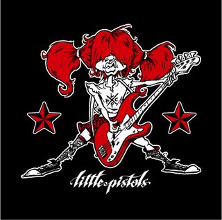
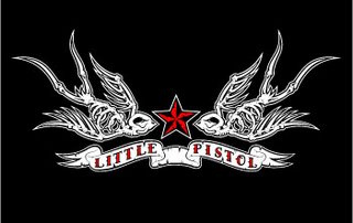
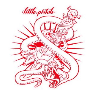
This is one of the first freelance projects that i took on the west coast.... about a year ago. and it is probably the most fun one that i have done to date. Little Pistols is a punk rock clothing line for kids run by 2 great people. i loved the concept! I was basically asked to do some "rock-n-roll" art (in adobe illustrator) to be printed on youth tees, hoodies, baby onesies, creepers, patches, pins, ect... below is some of the stuff i came up with. you can see more at www.littlepistols.com. they have a bunch of awesome stuff for sale on their website... everything from studded belts sized for kids to bondage pants and safety pinned skirts! A great place to spoil that little punker in your life.
Wednesday, September 20, 2006
CONVERSE PROJECT
I am lucky enough to get to create graphics for Converse through my job on a regular monthly basis. these designs are used for products in their company stores. if you're by one of their stores, go in, check it out... they've got some really cool stuff (and i've got a bunch of art in there as well!). here's a design i was pleased with that they just put up for sale on their website:
here's a detail of my art:
and HERE is the link.
here's a detail of my art:
and HERE is the link.
Monday, September 18, 2006
ANGLER PROJECT
here's some shots of a project that i did some time back. this was for a screenprint on a t-shirt... the tag lines and customer logos have been removed.
1. pencils: a scan of my initial sketch. i was able to draw a caricature of my uncle jim (who happens to be an avid fisherman) instead of just creating some random character.
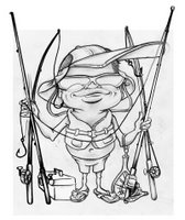
2. photoshop: i took my scan into photoshop to clean up and airbrush. i also made some modifications to my sketch to capture a better likeness of my uncle.
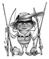
3. color: i separated out the different blocks where various colors were going and then added the color using both different layer styles and actually going in and airbrushing different colors. using this technique is good when working with art that will eventually be screenprinted because the selections can be made for the production-side-of-things easier.
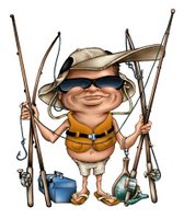
4. revision set #1: kinda expected this. i always seem to get a bunch of revisions when i work on "outdoor" designs... i don't think that i "get" that customer as well as i would like to (and it must show). anyway, along with some changes to the type and addition of customer logo on cap (not shown), i was asked to incorporate a fish, some dramamine (seasick medication); and a sunburn.
5. revision set #2: the final version. changed life vest to Hawaiian shirt, changed fish, changed reels to "proper off-shore" reels, changed net to that hook they use.... forgot what its called, and added more "fishing trinkets".
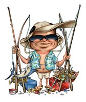
i was able to get a couple of these shirts to ship to my aunt and uncle. there excitement about the final shirt was the most rewarding part of this project.
i'll try to get some newer art on a post in the future.
Monday, September 11, 2006
PROMO TEE GRAPHICS:
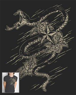
here are 4 designs that i recently created (or modified from old art that i did in the past) to email to potential clients & contacts that i have made. just something to give them a reference of the kind of art that i can do. these jpgs have already helped me land an interview that resulted in a BIG freelance project!!!! i'll show more of that in future posts when the designs "go public"/get placed in stores... or when i get the ok from them to post.
Subscribe to:
Posts (Atom)